Scan&Order
UX/UI design for a dietary filtering application
Background/Concept
This project was made as a part of a university project and required me to design a solution based on a self-researched problem that is evident amongst digital ecosystems today; people today have trouble ordering food online due to various food allergies and restrictions. The answer to this problem comprised of user research, comparative analysis, prototyping and testing. The application I designed was a dietary filtering application which partners up with famous food delivery applications such as Uber Eats and Doordash. It also allows users to share their dietary information for combined ordering that allows for an optimal experience. Overall, this project challenged my critical thinking skills and allowed me to view the world of UX from a new angle,
Timeline
12 weeks
Collaboration
Individual
My role
UI/UX designer
The user research was done carefully by making empathy maps after interviewing users. The user personas were carefully checked and improved for any errors found after the task was done. The empathy maps for both the applications, Ubereats and Doordash were analysed again to get a further understanding into the users mental model.
User Research
Ideation
The ideation process was fairly short and was possible through the brainstorming that was done taking assessment one into regard. I was originally leaning towards making an extension of the Doordash application which would use an AI tool to detect past orders and suggest new places accordingly. However, I soon realised that doing this would just solve the problem for one application. This led me to brainstorm even more ideas and come up with an application that develops QR codes containing one's dietary requirements. When the code is scanned by another user, they would get filtered results according to both their dietary requirements.
Key Features
Key features of the application were identified and designed using a site map
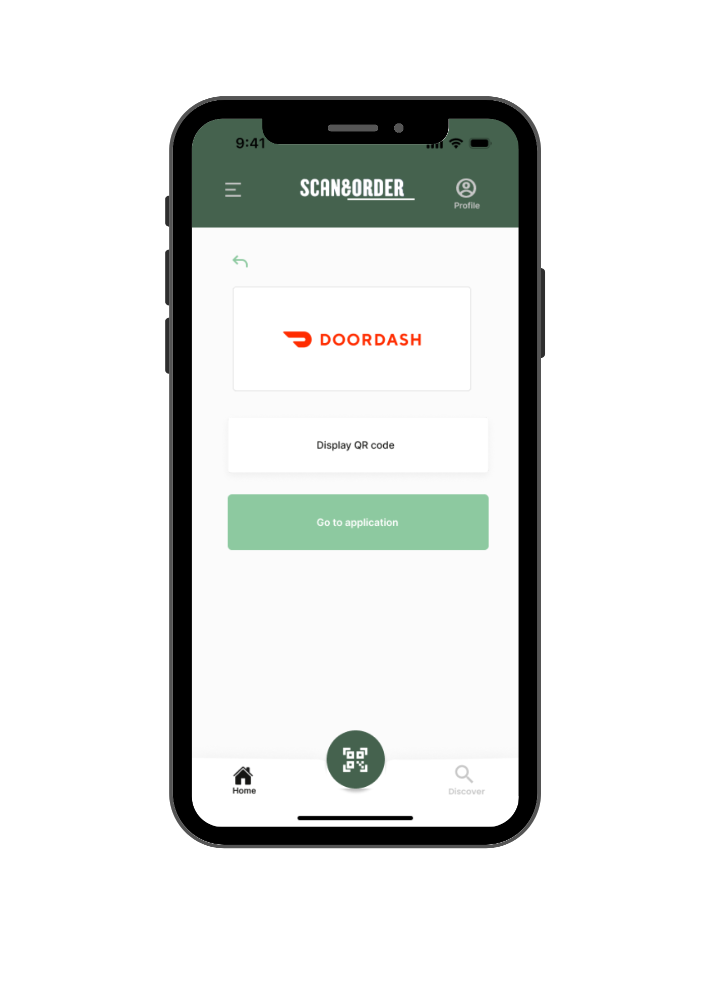
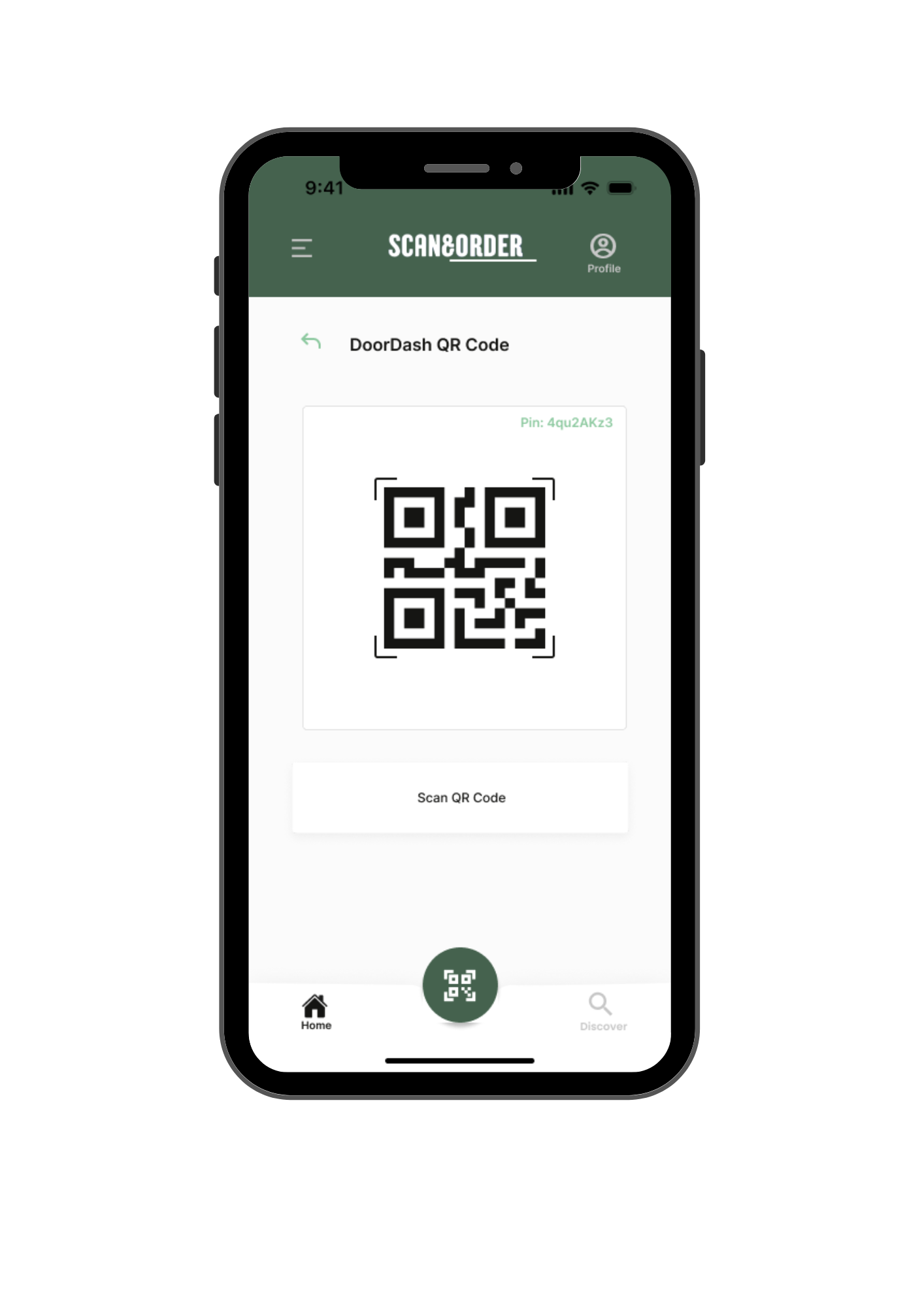
TASK FLOW 1: Displaying the Doordash QR code on device.
Key:
Prototyping
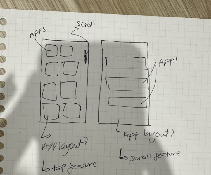
For the prototyping, I mainly focused on the interactions that were going to take place (both major and minor interactions) while still focusing on the UI of the design. I wanted users to have good user experience and hence made sure to make my design straightforward and understandable.
For example, in the image above, the wireframe I had created was performed using the wizard of oz method while they were doing the think aloud process helped me in developing the users mental model regarding this low fidelity prototype. I also kept Nielsen’s heuristics in mind after evaluating the feedback from task 1 and therefore incorporated many error prevention methods such as double checking with the users if either they wanted to delete or archive an application. The feedback I got from the users was carefully analysed and many components from the low fidelity prototype were improved.
Testing & Analysis
The think aloud method from the users was recorded and then analysed thoroughly. The results were then carefully analysed according to each feature of the UI and supporting interactions.
Iterations
There were 3 iterations made to finally decide on the overall aesthetic. All three iterations were shown to the users for feedback and then were altered.
ITERATION 1
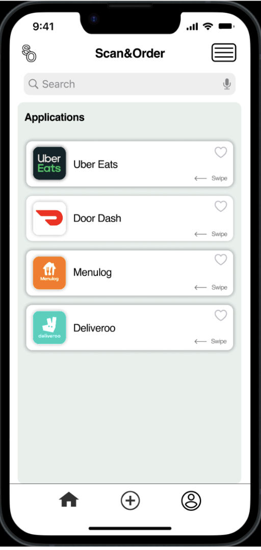
This iteration was developed on the Adobe XD software and roughly focused on the UI component of the application. I was pleased with the overall idea as it greatly resembled the paper prototype. However something was off (either the colour scheme or the overall layout of the application) so I sent this iteration to all three of my users for feedback.
The feedback consisted of both negative and positive comments which included the colours, the compact layout and the prioritisation of some content.
ITERATION 2
After understanding the feedback from Iteration 1, iteration 2 was formed and consisted of minor changes. For example, the applications were a bit more spread out from one another based upon the feedback received that the previous iteration looked a bit compacted. This iteration was sent to the users again for feedback and the main point received were;
It still looked a bit off in terms of the design
There were no cross options
Apps were not labeled
ITERATION 3
The final iteration that was developed was completely different in terms of the aesthetics. Looking at and understanding the user feedback from both the previous iterations it was decided to try something completely new.
However it didn’t follow most of the apple guidelines and was therefore off-putting to users.
Final Output
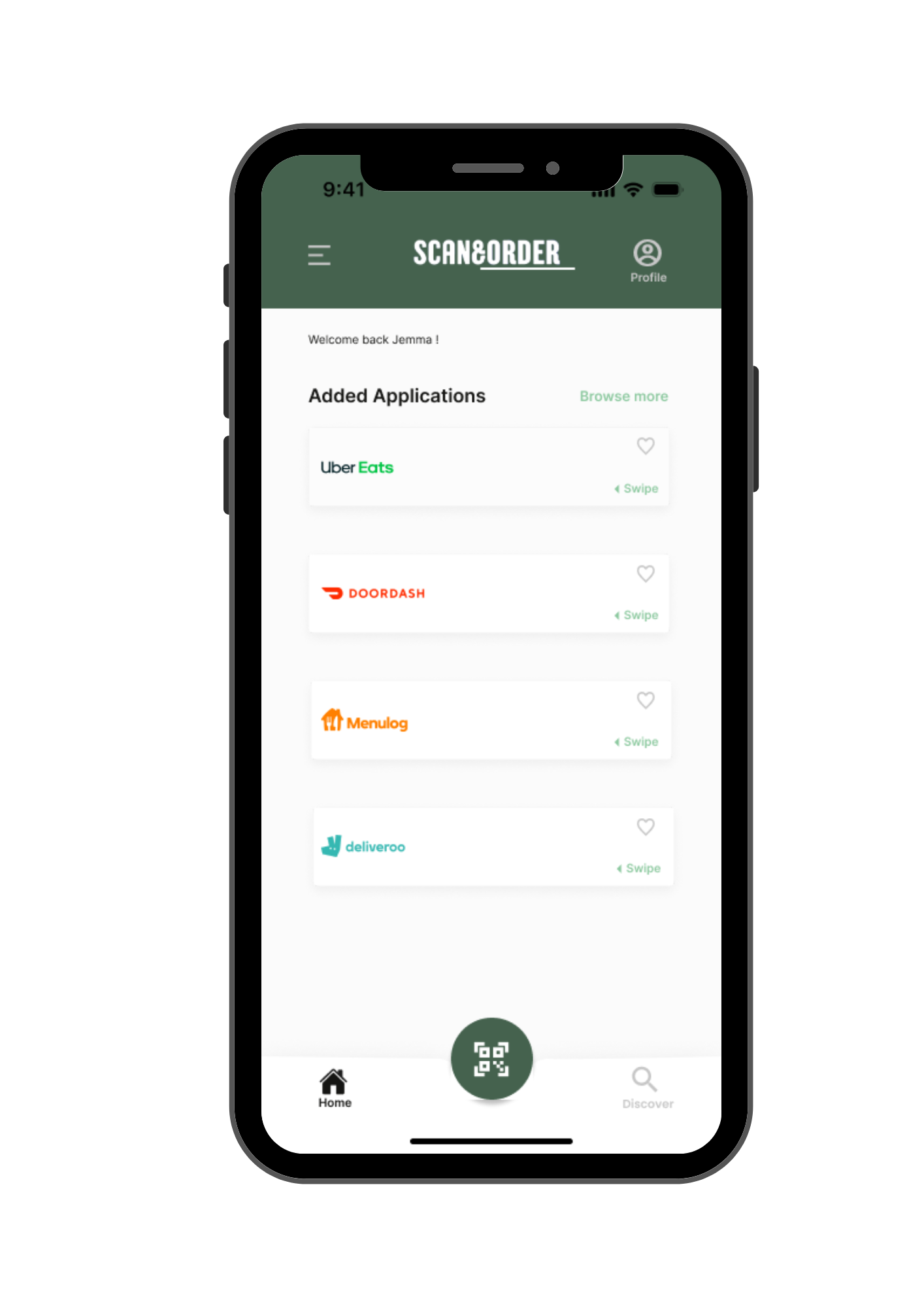
The final output was a completely changed look when looking back at the iterations. This design adhered to all the apple guidelines in terms of safe zones, components and hierarchy.
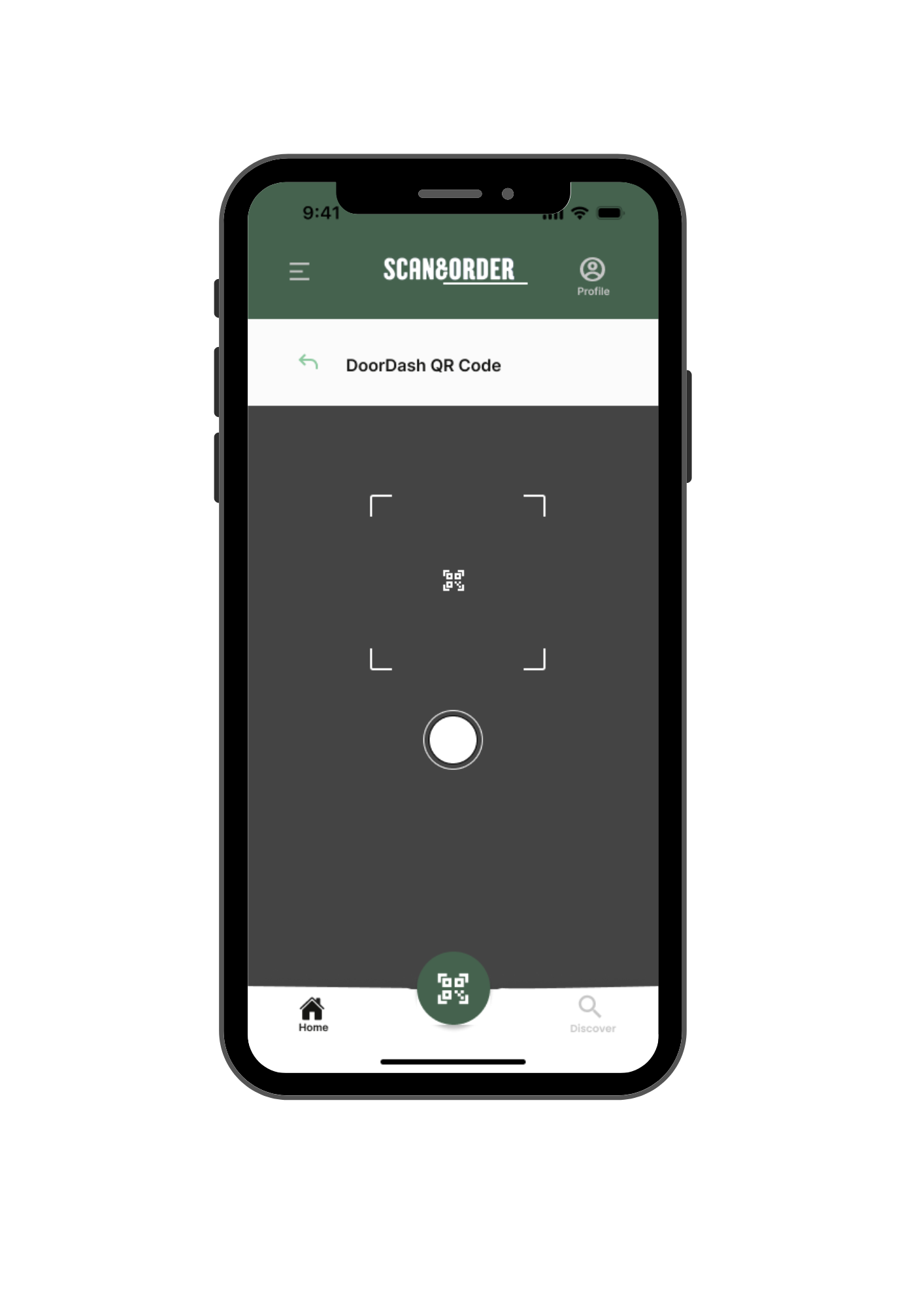
Camera
Company Page
Scan QR Code
Home Page
Key Learnings
This project has allowed me to understand the concepts of UI and UX design in relations to platforms such as Figma and Adobe XD. It has taught me the importance of understanding users from a deeper level to gain an insight into their pain points while also applying relevant guidelines and heuristics. Overall is had helped me broaden my creative boundaries as an emerging designer.


